Learn to use the different types of resources in Ms Project 2019
With Microsoft Project 2019, for work, material and cost resources we are taking as an example of the construction of a house. We will emphasize on obtaining the construction license and building the concrete slab for the basement.
Learn or review the basics of Microsoft Project in about 20 minutes. If you are new to the subject or you want a refresh, we hope to provide you with the knowledge you are looking for. That you want to see it in all or some parts here is a description of the content.
Learn the basics of Microsoft Project 2013: Add Project Information like Start Date and Working Days/Time & Holiday Exceptions in Calendar. Add/Delete Tasks, Add Summary Task, Add Milestones, Add Recurring Tasks. Understand Task Types & Task Dependency. Also, learn to add Lag or Lead time to a task.
Continuing from Part 1, in this video learn about adding Constraints to a task and deadline. Learn about adding Resources to your project and applying them to a task. Add Work, Material and Fixed Cost Resources. Change the working hour of a Resource. Learn how to change $/Hr of a Resource if their rate changes during the project.
(Print topic starts from Minute 10) In this video learn to add complete percentage to tasks, change resource allocation, split tasks, add overtime. Print Gant Chart, Reports, Visual Reports. And Send Project as attachment and as a PDF.
In this video learn to format Tasks, Gant Chart. Create Custom Views of Gant Chart, Calendar or tables. Create Custom fields with calculation and copy it to the Global template to use in future project files. Download free:
In this video, we will discuss How To Create S Curve using MS Project, Microsoft Project is a project management software product, developed and sold by Microsoft.
It is designed to assist a project manager in developing a plan, assigning resources to tasks, tracking progress, managing the budget, and analyzing workloads.
Hello everyone today I'm going to show you how to create a salary structure floating bar chart as a human resource professional it is very common that you would be using a salary structure wrench which is essentially the recommended compensation level for all the jobs in all levels in the company.
So today I'm going to show you based on a table that you're given or you want to create how do we create a chart where we have all the job levels at the bottom and then we showed mean mid and max for the pay range of each of the levels so the first thing you need to do is to create a table in this format and one thing agent note is that the max the row with the highest value needs to stay on the top and I will show you why and then next you select the data range where's the Hatters and go to recommended chart and the one that you want to select this clustered column chart so you go to okay it will give you a chart one thing I want to share with you is that you can move actually move the chart to a new sheet which makes it look bigger and nicer the next thing you want to do is to select any of those data series go to format and there on the right with data overlap bring everything to a hundred percent and this way you'll have all the three parts or overlapped into one you can also adjust the gap works with which can narrow the gap between your bars but it's not required so that's now you have all the bars the next thing you can do is to select the lowest one the minimum and then go to format go to fill and select white so you can see all the ones become white you might also notice that you would have the grid line here and doesn't look nice when you have the white part the trick here is to delete them therefore you can only have the floating chart here you can also change the color of the of your bars as you wish for example this one maybe I want to change to a light blue I can't do that and then you can add basically add a data label to all the two are the bars for the max for the MIT and for the mean yep and here we go so this is how a salary structure floating bar chart would it look like
Excel HR dashboard - Chart for HR Professionals Add a variety to your reporting with an innovative graph for your presentations, and precise...
Intro to Pivot Tables, Charts, Interactive Excel Dashboards, & Slicers
This video tutorial provides a basic introduction to pivot tables, charts, slicers, and interactive excel dashboards. It explains how to simplify a large source data file with pivot tables and visually represent it with Pivot Charts in Excel 2016 such as Bar Graphs, Column Charts, Line Graphs, Pie Charts, Doughnut Charts, and Map Charts.
Introduction to Pivot Tables, Charts, and Dashboards in Excel
In this video series, you will learn how to create an interactive dashboard using Pivot Tables and Pivot Charts. Works with Excel 2003, 2007, 2010, 2013 for Windows & Excel 2011 for Mac.
Don't worry if you have never created a Pivot Table before, I cover the basics of formatting your source data and creating your first Pivot Table as well. You will also get to see an add-in I developed named pivotal that makes it easier to work with some aspects of Pivot Tables.
have another video that shows how to reformat the pivot chart in Excel 2010. In the video above I'm using Excel 2013 and the menus are different from Excel 2007/2010. Here is the
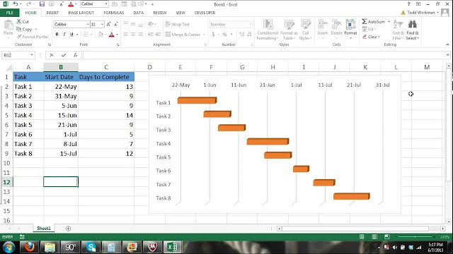
In this tutorial, we will show you how to create a Gantt Chart using Excel. Excel doesn't actually have a default Gantt Chart, therefore we will modify a bar chart to turn it into a Gantt Chart.
Step 1: First we need to enter our data such as the tasks, the start date, days completed and days remaining. See the image below and enter your data exactly as shown in the image.
Step 2: After entering your data into the cells, you can start building your Gantt Chart.
Step 3: Right click on the blank chart and select data.
Step 4: After clicking OK in the Start Date Series box the Select Data Source" box will appear again.
Step 5: Right click on the chart again. Select Data and add a new series. This time you will add the "days completed" to the chart. You will do the same thing you did for the start date. Enter "Days completed" in the Series Name and select all the cells (even the cell without content) listed under Days Complete. See Below.
Step 6: Now we will add another series to the chart for the Days Remaining column the same way we did the Start Date Series and the Days Completed Series.
Step 7: In this step, we will hide the Start Date Bars because they are not needed for visual purposes in our Gantt Chart.
A Network Diagram is a graphical way to view tasks, dependencies, and the critical path of your project. Boxes (or nodes) represent tasks, a...
A Network Diagram is a graphical way to view tasks, dependencies, and the critical path of your project. Boxes (or nodes) represent tasks, and dependencies show up as lines that connect those boxes. After you've switched views, you can add a legend, customize how your boxes appear, and print your Network Diagram.
This video walks you through how to create a network diagram from a list of activities and their associated durations.
To illustrate this process, I use a simple network diagram created in Excel. Understanding the core concepts associated with creating a network diagram is critical to passing the PMP exam.
Microsoft Project is a project management software product, developed and sold by Microsoft. It is designed to assist a project manager in d...
Microsoft Project is a project management software product, developed and sold by Microsoft. It is designed to assist a project manager in developing a plan, assigning resources to tasks, tracking progress, managing the budget, and analyzing workloads.
Project Management Tutorial: How to draw a Gantt chart with more complicated predecessors. All right in this video we're going to go over them slightly more difficult Gantt chart example so here we have our project with activities a through I there's a different logic going on here, for example, a has no predecessor whereas activities B and C both have to start once a is complete and then activity D here would have to start with B is complete and so on you can see there's us a few different paths on our project here. Download Free Template:
So first things first let's grab our graph paper let's bring it in here it's going to make your lives a little bit easier for drawing on and then what we want to do first is we want to label our axes all right so there we go we have our axes labeled and now we just want to start filling in our Gantt chart so starting with activity a has no predecessor so it begins at the start to the very beginning of the project and it has duration of two days so we're going to start at the very beginning of the first day and go to the end of the second day right that's one two days okay activity be its first its predecessors a so it can't start until a is done and that has three days long it is three days long so one two three right it's starting where a ends activity C it has to start where a ends and it's two days long so activity C it's going to start at the end of a and it's two days long notice that it's not always an activity C here isn't starting with B ants because that's not the case it that doesn't say anything will be having to finish it only depends on a alright so activity D activity D depends on activity B and it's three days long so we're gonna come down to D we're going to find our B ends that's right here and we're going to go with three days so one two three all right now next up we have activity II might depends on C and it's four days long so C ends here so one two three four right that's activity depends on C that's four days long kivett e f depends on activity D and it's two days long so we're going to come here this is f D ends right here so we're going to go two days all right now we have activity G it depends on B and it's only one day long so be ended over here so we're at G and it's just one little day down there H we have depends on activity D so D ends here I'm down H is one to three days long and I our last activity depends on C and it's like two days long so we're going to come down here and go one two so there you go this is actually our Gantt chart it's more complicated than the last example but you're seeing that you know as we get more more and more activities in a of not a straightforward logic here the Gantt chart can get a little bit cumbersome alright so I'll see you in the next video and we'll talk about some quick advantages and disadvantages of the Gantt chart
This video demonstrates benefits of using Bar Charts to reduce overall project duration. The critical path method (CPM), or critical path an...
This video demonstrates benefits of using Bar Charts to reduce overall project duration.
The critical path method (CPM), or critical path analysis (CPA), is an algorithm for scheduling a set of project activities. It is commonly used in conjunction with the program evaluation and review technique (PERT). Download:
This article will show you how to create a timeline in Excel, using a template in the context of planning a business conference. Hosting a successful business conference can take months of planning and it’s the type of project where a timeline is essential. It involves plenty of moving parts and usually has quite a few stakeholders.
In this scenario, an event planner would start by making a list of tasks. These tasks may include managing a budget, scouting and securing a conference site, hosting speakers, hotel arrangements, conference schedule, and more. With all this information, you can either look at a timeline template in Excel or find a more robust solution to first make a Gantt chart and use that to create a timeline. This tutorial will show you how to do both.
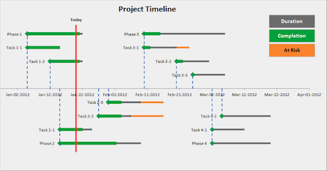
This video is a 24-minute in-depth explanation showing how I created a project timeline in Excel 2010. I take you step-by-step through most of the detail and give helpful tips along the way.
Scheduling for Success with Microsoft Project, After you complete the initial thinking about your project’s objectives, it’s time to put tog...
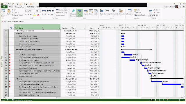
Scheduling for Success with Microsoft Project, After you complete the initial thinking about your project’s objectives, it’s time to put together a schedule. When you start a new schedule, you add tasks and organize them efficiently so that the project end date occurs as soon as possible.






Follow Us
Were this world an endless plain, and by sailing eastward we could for ever reach new distances