 |
| What Is a Bar (Gantt) Chart |
What is a Bar (Gantt) Charts?
A bar (gantt) chart is ‘‘a graphic representation of project activities, shown in a time-scaled bar line with no links shown between activities’’ (Popescu and Charoenngam 1995, p. 96). The bar chart was originally developed by Henry L. Gantt in 1917 and is alternatively called a Gantt chart.1 It quickly became popular—especially in the construction industry—because of its ability to graphically represent a project’s activities on a time scale.
Before a Bar (Gantt) chart can be constructed for a project, the project must be broken into smaller, usually homogeneous components, each of which is called an activity, or a task. No absolutely correct or incorrect way to break down a project exists; however, the scheduler should take a balanced approach and break it down into a reasonable number of activities that are easily measured and controlled without being overly detailed.
An activity, or a task, may be as large as laying the foundation of a building, as small as erecting the formwork of one footing, or anywhere in between. The duration of each activity must be estimated. Bars are then drawn to show, for each activity, the duration and the starting and ending points. As mentioned previously, links between activities are not usually shown.
On a Bar (Gantt) chart, the bar may not indicate continuous work from the start of the activity until its end. For example, the activity Getting a Building Permit may be represented by a 2-month-long bar. However, most of this time is a waiting period. Likewise, a Concrete Foundation summary activity may include several days of waiting for concrete to cure. Noncontinuous (dashed) bars are sometimes used to distinguish between real work (solid line) and inactive periods (gaps between solid lines) (Callahan, Quackenbush, and Rowings 1992).
Bar (Gantt) charts have become a vehicle for representing many pieces of a project’s information. Many variations of bar charts have evolved; some simply show the start and end of each activity (Figures 2.1 and 2.2),
 |
| Figure 2.1 Bar (Gantt) chart for placing a simple slab on a grade |
 |
| Figure 2.2 Alternative Bar (Gantt) chart for placing a simple slab on a grade placed in two parts |
Some are loaded with the resource or budget numbers (Figures 2.3 and 2.4),
 | ||
| Figure 2.3 Bar (Gantt) chart for placing a simple slab on a grade, with activities ‘‘necked’’ during nonwork periods |
 |
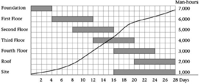
| Figure 2.4 Bar (Gantt) chart—loaded with man-hours—for construction of a two-story building |
and others compare the as-planned schedule with the as-built schedule (Figure 2.5).
 |
| Figure 2.5 Bar (Gantt) chart—loaded with the budget—for construction of a two-story building |
Using Primavera Project Manager (P6) software (Recently acquired by Oracle), we can show activities with interruptions as continuous bars or as ‘‘necked’’ bars (Figure 2.3).
Since Bar (Gantt) charts basically use the x-axis only (to depict time), the y-axis is used (in addition to showing individual activities) to represent a variable across time, such as man-hours (Figure 2.4), budget (Figure 2.5), percent complete (Figure 2.6), and so forth. This variable is usually shown as a curve superimposed on the bar chart. In Figure 2.5, S curves (also called lazy-S curves) represent the percent on extrapolation from the as-built curve.
 |
| Figure 2.6 Bar chart for replacement of an old roof, showing a comparison between the percent complete of the planned (as-planned) activities (thin line) and that of the actual (as-built) activities (thick line). The dashed line is an extrapolation of the actual curve. |
The notion that Bar (Gantt) charts and Gantt charts are two different types of charts is baseless. There is a variety of bar chart types and any or all of them can be called Gantt chart.
What are the main advantages of bar (gantt) charts:
Bar (Gantt) charts have gained wide acceptance and popularity mainly because of their simplicity and ease of preparation and understanding. No ‘‘theory’’ or complicated calculations are involved. Anyone can understand them. They can be prepared anywhere with just a pencil and paper. So, although bar charts can carry—or be loaded with—other information, the user must be careful not to overload them and, thus, eliminate their main advantage: simplicity.
Unlike networks, bar charts are time-scaled; that is, the length of a bar representing certain activity is proportional to the duration of that activity. Just by looking at the chart one can get an idea on the duration of each activity.
Another advantage is that bar charts particularly appeal to persons who do not have a technical background. For example, some clients and upper-level managers may better understand the plan for carrying out a construction project by looking at a bar chart than by looking at a schematic of a logic network.
A final advantage of bar charts is that, with the advent of the critical path method (CPM) and the evolution of powerful computers, bar charts did not perish or lose importance. Instead, they evolved into a different supporting role that made them more valuable and popular.
Download also:
Download also:
What are the main disadvantages of bar (gantt) charts:
The main disadvantage of Bar (Gantt) charts is lack of logical representation (relationships): Why did this activity start on that date? Bar (Gantt) charts do not reveal the answer. It could be a logical relationship, a resource constraint, or a subjective decision by the project manager. Although some software programmers tried to depict logical relationships on bar charts, the result was not always clear. The logic lines would get tangled, and unlike networks, bar charts do not allow the length of the bars to be subjectively changed or the bars to be moved around to make the chart look or read better.
Another limitation, rather than a disadvantage, of bar charts, is the size and complexity of projects. Bar (Gantt) charts may not be practical for projects with large numbers of activities—unless you use them in two ways:
- 1-You show a subset of the work activities to maintain the simplicity of the chart. For example, the general contractor can produce bar charts for activities during only a certain period, for critical activities (activities that cannot be delayed or the entire project would be delayed only, for activities in a certain section of the project, or for activities under a certain subcontractor.
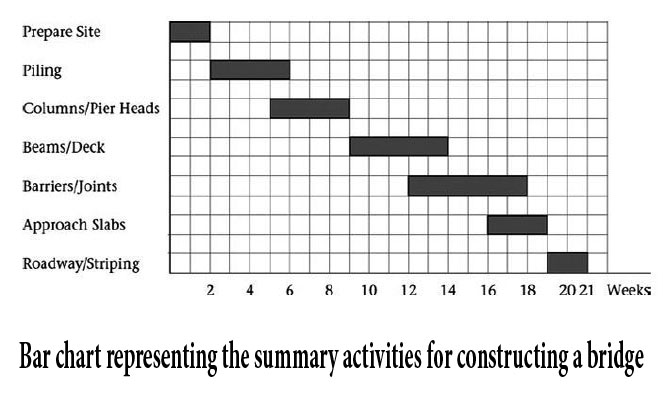
- 2-You, show summary bars (each bar represents a group of activities combined on the basis of a certain criterion such as department, major component, or responsibility). This can be done during the early planning phase, when details are not available (see, for example, Figure 2.7), and when you are reporting the information to high-level management.
 |
| Figure 2.7 Bar (Gantt) chart representing the summary activities for constructing a bridge |


0 Comment: